17.1 Scatter Diagrams and Correlation
SL 4.4
- what bivariate data is, and the difference between the independent and the dependent variable
- how to draw and sketch a scatter diagram
- how to describe correlation: positive or negative, strong or weak, linear or non-linear
- what Pearson’s product-moment correlation coefficient \(r\) measures, how to find it with technology, and how to interpret it
- why correlation does not imply causation
- how to draw a line of best fit by eye through the mean point \((\bar{x}, \bar{y})\)
Bivariate data
In Unit 15 each piece of data was a single number. Now each item gives us two numbers, which come as a pair \((x, y)\). Data like this is called bivariate data. Some examples:
- the daily temperature (\(x\)) and the number of cold drinks a café sells (\(y\))
- a student’s Chemistry mark (\(x\)) and the same student’s Biology mark (\(y\))
- the age of a phone (\(x\)) and its resale price (\(y\))
We want to know how \(x\) and \(y\) are related.
Scatter diagrams and linear correlation
The first step is almost always to plot the pairs as points. This picture is a scatter diagram.
Independent and dependent variables
Often one variable is chosen or controlled, and the other one responds to it.
Independent and dependent variables Not in the formula booklet
- The independent (or controlled) variable is the one we choose or that comes first. We call it \(x\) and plot it on the horizontal axis.
- The dependent variable is the one that responds. We call it \(y\) and plot it on the vertical axis.
For example, a farmer chooses how much fertiliser to use (\(x\), independent) and then measures the crop yield (\(y\), dependent). Later we will find a line that predicts \(y\) from \(x\). It is called the regression line of \(y\) on \(x\) (see Section 17.2).
Describing correlation
If the points lie close to a straight line, we say there is linear correlation between \(x\) and \(y\).
Describing correlation Not in the formula booklet
- Positive correlation: \(y\) tends to increase as \(x\) increases.
- Negative correlation: \(y\) tends to decrease as \(x\) increases.
- Strong correlation: the points are close to a straight line. Weak correlation: the points are spread out around a line.
- No (or zero) correlation: there is no linear pattern.
- Non-linear: there is a clear pattern, but it is a curve, not a line.
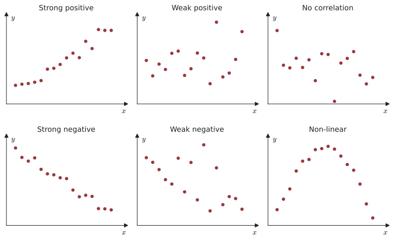
Look at the last diagram in Figure 1. There is a very clear relationship between \(x\) and \(y\), but it is a curve. So “no linear correlation” does not mean that \(x\) and \(y\) are unrelated. This is why you should always look at the scatter diagram, not only at a number.
Correlation and causation
Suppose the Chemistry and Biology marks of a class show strong positive correlation. It is not correct to say that a high Chemistry mark causes a high Biology mark. Both marks may depend on something else, such as how hard the student works or their reading skills.
A strong correlation shows that two variables change together. It does not prove that a change in one variable causes the change in the other. There may be a third variable that affects both, or the link may be just coincidence.
A famous case is the link between smoking and lung cancer. Statistics first showed the strong correlation, but scientists needed medical experiments to show that smoking was really the cause.
Drawing a scatter diagram
Example 1 Ten students recorded the time they spent revising for a test (\(x\) hours) and the number of errors they made in the test (\(y\)).
| \(x\) | 2 | 3 | 5 | 6 | 8 | 9 | 11 | 12 | 14 | 15 |
|---|---|---|---|---|---|---|---|---|---|---|
| \(y\) | 31 | 33 | 27 | 29 | 22 | 24 | 18 | 19 | 13 | 15 |
Draw a scatter diagram for the data and describe the correlation.
Revision time is the independent variable, so it goes on the horizontal axis.
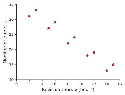
The points go down from left to right and lie close to a straight line. There is a strong negative linear correlation: students who revised for longer tended to make fewer errors.
- Add Lists & Spreadsheet. Type a name at the top of column A (for example
xx) and enter the \(x\)-values. Name column B (for exampleyy) and enter the \(y\)-values. - Add Data & Statistics. Click Click to add variable at the bottom and choose
xx; click on the left side and chooseyy. - Use the left and right arrow keys to move from point to point and read the coordinates.
When you sketch the diagram on paper:
- label both axes with the variable names (and units)
- show the minimum and maximum values on each axis
- keep the positions of the points correct relative to each other
- check that every point is plotted.
Pearson’s product-moment correlation coefficient
A scatter diagram shows the correlation. A number that measures it is the product-moment correlation coefficient, \(r\) (also called Pearson’s \(r\)). In words, \(r\) is the average of the products \((x - \bar{x})(y - \bar{y})\) (how far each point is from the means, multiplied together), scaled so that it always lies between \(-1\) and \(1\).
Pearson’s product-moment correlation coefficient Not in the formula booklet
For \(n\) pairs of data \((x_i, y_i)\),
\[ r = \frac{\sum (x - \bar{x})(y - \bar{y})}{\sqrt{\sum (x - \bar{x})^2 \, \sum (y - \bar{y})^2}} . \]
The value of \(r\) is always in the interval \(-1 \le r \le 1\).
- \(n\): the number of pairs of data
- \((x_i, y_i)\): the \(i\)th pair of data values
- \(r\): Pearson’s product-moment correlation coefficient
- \(\bar{x}\), \(\bar{y}\): the means of the \(x\) values and of the \(y\) values
You are not expected to use this formula in an exam: the syllabus says technology should be used to find \(r\).
Interpreting \(r\)
- The sign of \(r\) gives the direction: \(r > 0\) is positive correlation, \(r < 0\) is negative correlation.
- The size \(\lvert r \rvert\) gives the strength: the closer \(\lvert r \rvert\) is to \(1\), the closer the points are to a straight line.
- \(r = 1\) or \(r = -1\): all the points lie exactly on a straight line. \(r = 0\): no linear correlation.
| Value of \(\lvert r \rvert\) | Description |
|---|---|
| \(0.75 \le \lvert r \rvert \le 1\) | strong |
| \(0.5 \le \lvert r \rvert < 0.75\) | moderate |
| \(0.25 \le \lvert r \rvert < 0.5\) | weak |
| \(0 \le \lvert r \rvert < 0.25\) | very weak or none |
These boundaries are only a guide. Different books use slightly different values. In an exam, describe both the direction and the strength, for example “strong negative linear correlation”.
\(r\) tells you how close the points are to a straight line. Data that follows a curve can have \(r\) close to \(0\) even though the two variables are strongly related. Always check the scatter diagram.
Example 2 Find the value of \(r\) for the revision data in Example 1, and interpret it.
Using the GDC (see the note below): \(r = -0.966\) (3 s.f.).
\(r\) is negative and very close to \(-1\), so there is a strong negative linear correlation between revision time and the number of errors.
Enter the data in Lists & Spreadsheet (columns xx and yy), then Menu → Statistics → Stat Calculations → Linear Regression (mx+b). Choose X List: xx, Y List: yy and press OK.
The output shows m, b, r² and r. Read the value of r. (The same screen also gives the regression line — see Section 17.2.)
Finding \(r\) by hand
You will not need to do this in an exam, but one calculation by hand helps to see what \(r\) measures. Each product \((x - \bar{x})(y - \bar{y})\) is positive when a point is above-right or below-left of the mean point, and negative otherwise. So the sum in the numerator is large and positive when most points follow an upward line.
Example 3 Find \(r\) for the data below, without a GDC.
| \(x\) | 1 | 2 | 3 | 4 | 5 |
|---|---|---|---|---|---|
| \(y\) | 2 | 4 | 5 | 4 | 5 |
\(\bar{x} = \dfrac{15}{5} = 3\) and \(\bar{y} = \dfrac{20}{5} = 4\).
| \(x - \bar{x}\) | \(-2\) | \(-1\) | \(0\) | \(1\) | \(2\) | Sum |
|---|---|---|---|---|---|---|
| \(y - \bar{y}\) | \(-2\) | \(0\) | \(1\) | \(0\) | \(1\) | |
| \((x - \bar{x})(y - \bar{y})\) | \(4\) | \(0\) | \(0\) | \(0\) | \(2\) | \(6\) |
| \((x - \bar{x})^2\) | \(4\) | \(1\) | \(0\) | \(1\) | \(4\) | \(10\) |
| \((y - \bar{y})^2\) | \(4\) | \(0\) | \(1\) | \(0\) | \(1\) | \(6\) |
\[ r = \frac{6}{\sqrt{10 \times 6}} = \frac{6}{\sqrt{60}} = 0.775 \text{ (3 s.f.)} \]
This is a fairly strong positive linear correlation.
Changing the units does not change \(r\)
If every \(x\)-value is changed to \(u = px + q\) and every \(y\)-value to \(v = sy + t\) (with \(p, s \neq 0\)), the scatter diagram is only stretched and moved. The shape of the pattern stays the same.
\(r\) and linear changes of scale Not in the formula booklet
If \(u = px + q\) and \(v = sy + t\), then
- \(r_{uv} = r_{xy}\) when \(p\) and \(s\) have the same sign,
- \(r_{uv} = -r_{xy}\) when \(p\) and \(s\) have opposite signs.
So \(\lvert r \rvert\) never changes. Changing units (hours to minutes, cm to m, °C to °F) does not change \(r\).
- \(u\), \(v\): the new variables after the change of scale
- \(x\), \(y\): the original variables
- \(p\), \(s\): the constants the variables are multiplied by
- \(q\), \(t\): the constants added
- \(r_{uv}\): the correlation coefficient of \(u\) and \(v\)
- \(r_{xy}\): the correlation coefficient of \(x\) and \(y\)
Example 4 The teacher in Example 1 writes each revision time in minutes, \(u\), and each student’s test score, \(v\). The test had 50 questions worth 2 marks each, so \(v = 100 - 2y\).
| \(u\) | 120 | 180 | 300 | 360 | 480 | 540 | 660 | 720 | 840 | 900 |
|---|---|---|---|---|---|---|---|---|---|---|
| \(v\) | 38 | 34 | 46 | 42 | 56 | 52 | 64 | 62 | 74 | 70 |
(a) Find \(r\) for \(u\) and \(v\).
(b) Compare your answer with Example 2 and explain.
(a) GDC: \(r_{uv} = 0.966\) (3 s.f.).
(b) \(u = 60x\) and \(v = -2y + 100\). The multipliers \(60\) and \(-2\) have opposite signs, so \(r_{uv} = -r_{xy} = -(-0.966) = 0.966\). The strength is the same; only the direction changes, because more errors means a lower score.
Example 5 A café records the maximum temperature (\(T\) °C) and the number of bowls of hot soup sold (\(s\)) on 8 days.
| \(T\) | 25 | 26 | 27 | 28 | 29 | 30 | 31 | 32 |
|---|---|---|---|---|---|---|---|---|
| \(s\) | 58 | 55 | 57 | 49 | 47 | 44 | 40 | 41 |
(a) Find \(r\) and describe the correlation.
(b) Each value is standardised with \(z = \dfrac{x - \mu}{\sigma}\), where \(\mu\) and \(\sigma\) are the mean and standard deviation of that variable. Find the standardised values and the correlation coefficient of the standardised data.
(c) Comment on your answers to (a) and (b).
(a) GDC: \(r = -0.962\) (3 s.f.). There is a strong negative linear correlation: on hotter days the café sells less soup.
(b) One-variable statistics on the GDC gives \(\mu_T = 28.5\), \(\sigma_T = 2.29\), \(\mu_s = 48.875\), \(\sigma_s = 6.66\). The standardised values (2 d.p.) are
| \(z_T\) | \(-1.53\) | \(-1.09\) | \(-0.65\) | \(-0.22\) | \(0.22\) | \(0.65\) | \(1.09\) | \(1.53\) |
|---|---|---|---|---|---|---|---|---|
| \(z_s\) | \(1.37\) | \(0.92\) | \(1.22\) | \(0.02\) | \(-0.28\) | \(-0.73\) | \(-1.33\) | \(-1.18\) |
GDC (using the unrounded values): \(r = -0.962\).
(c) The value of \(r\) is the same. Standardising is a linear change of scale, \(z = \dfrac{1}{\sigma}x - \dfrac{\mu}{\sigma}\), with a positive multiplier \(\dfrac{1}{\sigma}\) for both variables. So \(r\) does not change. The scatter diagram of \((z_T, z_s)\) has the same shape, but it is centred at \((0, 0)\). (You will meet standardised values again in Unit 19.)
Line of best fit by eye
When the correlation is fairly strong and linear, we can draw a line of best fit on the scatter diagram.
Line of best fit by eye
- Find the mean point \((\bar{x}, \bar{y})\) and mark it on the diagram.
- Draw a straight line through the mean point that follows the trend of the points, with roughly the same number of points on each side.
Different people will draw slightly different lines by eye. In Section 17.2 we find the regression line, which is the single “best” line; it also passes through \((\bar{x}, \bar{y})\).
Example 6 The table shows the age (\(x\) years) and the value (\(y\) thousand dollars) of six cars of the same model.
| \(x\) | 1 | 2 | 3 | 5 | 6 | 7 |
|---|---|---|---|---|---|---|
| \(y\) | 18 | 16 | 15 | 11 | 9 | 9 |
(a) Find the mean point. \(\qquad\) (b) Draw a line of best fit by eye.
(c) Use your line to estimate the value of a car of this model that is 4.5 years old.
(a) \(\bar{x} = \dfrac{24}{6} = 4\) and \(\bar{y} = \dfrac{78}{6} = 13\). The mean point is \((4, 13)\).
(b) Plot the points and the mean point, then draw a line through \((4, 13)\) that follows the trend.
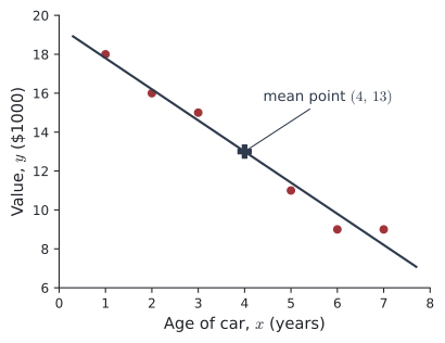
(c) The line in Figure 3 drops by about \(1.6\) (thousand dollars) for each year. At \(x = 4.5\) it gives \(y \approx 13 - 0.5 \times 1.6 = 12.2\), so about $12 200. (Answers from a line drawn by eye will vary a little.)
Using your GDC
| Task | TI-Nspire CX II |
|---|---|
| Enter the data | Lists & Spreadsheet: name two columns (e.g. xx, yy) and type the values |
| Scatter diagram | Data & Statistics: put xx on the horizontal axis and yy on the vertical axis |
| Mean point | Menu → Statistics → Stat Calculations → One-Variable Statistics for each list: read \(\bar{x}\) |
| Value of \(r\) | Menu → Statistics → Stat Calculations → Linear Regression (mx+b): read r |
Give \(r\) to 3 significant figures, as IB mark schemes do.
Common errors
| ✗ Wrong | ✓ Right | Why |
|---|---|---|
| “\(r = 0.02\), so \(x\) and \(y\) are not related.” | “There is no linear correlation.” | The relationship could be a curve. Look at the scatter diagram. |
| “\(r = 0.93\), so revising causes better marks.” | “There is strong positive correlation.” | Correlation does not imply causation. |
| \(r = -0.97\) is “weak” because it is negative. | Strong negative correlation. | The sign is the direction; the size \(\lvert r \rvert\) is the strength. |
| \(r = 1.24\) | Check the input. | \(r\) is always between \(-1\) and \(1\). |
| A line by eye that misses the mean point | Draw it through \((\bar{x}, \bar{y})\) | A line of best fit should pass through the mean point. |
| Putting the dependent variable on the horizontal axis | Independent on the horizontal axis | \(x\) (independent) across, \(y\) (dependent) up. |
Exercises
1 For each situation, state which variable is the independent variable and which is the dependent variable.
(a) The number of hours a phone is used, and the percentage of battery left.
(b) The weight of a parcel, and the cost of sending it.
(c) The amount of water given to a plant each day, and the height of the plant after one month.
(a) Independent: hours of use. Dependent: battery left.
(b) Independent: weight. Dependent: cost.
(c) Independent: amount of water. Dependent: height of the plant.
In each case the dependent variable responds to the independent one.
2 Describe the correlation shown in each scatter diagram A to D.
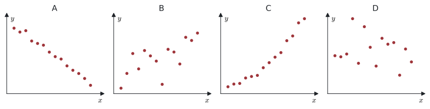
A: strong negative linear correlation. B: weak positive linear correlation.
C: a clear non-linear (curved) positive relationship. D: no correlation.
3 Match each value of \(r\) with a description.
\(r\): \(\;0.96,\; -0.45,\; 0.08,\; -0.91,\; 0.62\)
Descriptions: strong positive, strong negative, moderate positive, weak negative, no linear correlation.
\(0.96\): strong positive. \(\;-0.45\): weak negative. \(\;0.08\): no linear correlation. \(\;-0.91\): strong negative. \(\;0.62\): moderate positive.
4 Over one summer, a town finds a strong positive correlation between the number of ice creams sold each week and the number of people treated for sunburn each week. A newspaper says: “Ice cream causes sunburn.” Explain why this conclusion is not valid.
Correlation does not imply causation. Both variables depend on a third variable: hot, sunny weather. In sunny weeks more people buy ice cream and more people get sunburnt.
5 Paper 2 The arm span (\(x\) cm) and height (\(y\) cm) of eight adults are shown.
| \(x\) | 152 | 158 | 163 | 167 | 170 | 174 | 179 | 185 |
|---|---|---|---|---|---|---|---|---|
| \(y\) | 155 | 157 | 166 | 165 | 172 | 171 | 181 | 183 |
Find \(r\) and describe the correlation.
GDC: \(r = 0.974\) (3 s.f.). There is a strong positive linear correlation: people with a longer arm span tend to be taller.
6 Paper 1 Find the exact value of \(r\) for the data below, and give it to 3 s.f.
| \(x\) | 2 | 4 | 6 | 8 | 10 |
|---|---|---|---|---|---|
| \(y\) | 9 | 7 | 8 | 4 | 2 |
\(\bar{x} = 6\), \(\bar{y} = 6\). The deviations are \(x - \bar{x}\): \(-4, -2, 0, 2, 4\) and \(y - \bar{y}\): \(3, 1, 2, -2, -4\).
\(\sum (x - \bar{x})(y - \bar{y}) = -12 - 2 + 0 - 4 - 16 = -34\)
\(\sum (x - \bar{x})^2 = 16 + 4 + 0 + 4 + 16 = 40\), \(\quad \sum (y - \bar{y})^2 = 9 + 1 + 4 + 4 + 16 = 34\)
\[ r = \frac{-34}{\sqrt{40 \times 34}} = -\frac{34}{\sqrt{1360}} = -\sqrt{\frac{34}{40}} = -\sqrt{\frac{17}{20}} = -0.922 \text{ (3 s.f.)} \]
7 For a set of data, \(r_{xy} = 0.82\). Write down the correlation coefficient between
(a) \(u = 3x - 4\) and \(v = 5y + 1\),
(b) \(u = 3x - 4\) and \(w = 10 - 2y\).
(a) The multipliers \(3\) and \(5\) have the same sign: \(r_{uv} = 0.82\).
(b) The multipliers \(3\) and \(-2\) have opposite signs: \(r_{uw} = -0.82\).
8 Paper 1 The data below have a strong positive linear correlation.
| \(x\) | 3 | 5 | 6 | 8 | 9 | 11 |
|---|---|---|---|---|---|---|
| \(y\) | 14 | 17 | 21 | 22 | 26 | 26 |
(a) Find the mean point.
(b) A student draws a line of best fit by eye through the mean point and the point \((0, 7)\). Find the equation of this line.
(c) Use the line to estimate \(y\) when \(x = 10\).
(a) \(\bar{x} = \dfrac{42}{6} = 7\), \(\bar{y} = \dfrac{126}{6} = 21\). Mean point \((7, 21)\).
(b) Gradient \(= \dfrac{21 - 7}{7 - 0} = 2\), so \(y = 2x + 7\).
(c) \(y = 2 \times 10 + 7 = 27\).
9 Paper 2 A ball is thrown. Its height \(y\) metres after \(x\) tenths of a second is shown.
| \(x\) | 0 | 1 | 2 | 3 | 4 | 5 | 6 | 7 | 8 |
|---|---|---|---|---|---|---|---|---|---|
| \(y\) | 0 | 7 | 12 | 15 | 16 | 15 | 12 | 7 | 0 |
(a) Find \(r\).
(b) A student says: “So height and time are not related.” Comment.
(a) GDC: \(r = 0\).
(b) The student is wrong. There is no linear correlation, but there is a very clear non-linear relationship (the points lie exactly on the curve \(y = 8x - x^2\)). \(r\) only measures linear correlation.
10 Paper 2 Eight pairs of data are shown.
| \(x\) | 2 | 3 | 4 | 5 | 6 | 7 | 8 | 20 |
|---|---|---|---|---|---|---|---|---|
| \(y\) | 5 | 7 | 8 | 11 | 12 | 14 | 15 | 6 |
(a) Find \(r\) for all eight pairs.
(b) The pair \((20, 6)\) was a recording mistake. Find \(r\) for the other seven pairs.
(c) What does this show?
(a) GDC: \(r = -0.0552\) (3 s.f.).
(b) GDC: \(r = 0.993\) (3 s.f.).
(c) One outlier can change \(r\) completely: here from almost no correlation to a very strong positive correlation. Always draw the scatter diagram and look for outliers.