15.5 Cumulative Frequency and Box Plots
SL 4.2
- how to make a cumulative frequency table and draw a cumulative frequency graph
- how to use the graph to estimate the median, quartiles, percentiles, range and IQR
- the five-number summary and how to draw and read a box-and-whisker diagram (box plot)
- how to use parallel box plots to compare two distributions
Cumulative frequency
The cumulative frequency is a running total of the frequencies. It tells us how many values are less than the upper boundary of each class.
| Time, \(t\) (min) | Frequency | Cumulative frequency |
|---|---|---|
| \(0 \le t < 10\) | 8 | 8 |
| \(10 \le t < 20\) | 22 | \(8 + 22 = 30\) |
| \(20 \le t < 30\) | 40 | \(30 + 40 = 70\) |
| \(30 \le t < 40\) | 45 | \(70 + 45 = 115\) |
| \(40 \le t < 50\) | 25 | \(115 + 25 = 140\) |
| \(50 \le t < 60\) | 10 | \(140 + 10 = 150\) |
The table shows the times taken by 150 workers to travel to work.
- The first cumulative frequency equals the first frequency.
- Each next one adds the next frequency: \(8 + 22 = 30\) means 30 workers took less than 20 minutes.
- The last cumulative frequency is the total number of values, \(150\).
Cumulative frequency graphs
Drawing a cumulative frequency graph
- Plot each cumulative frequency against the upper class boundary of its class.
- Also plot the point (first lower boundary, \(0\)), here \((0, 0)\).
- Join the points with a smooth curve.
(If the points are joined with straight lines, the graph is called a cumulative frequency polygon.)
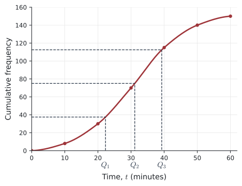
To find a median or quartile from the graph, start on the vertical axis, go across to the curve, then down to the horizontal axis. With \(n = 150\):
- median: cumulative frequency \(\frac{1}{2} \times 150 = 75\), which gives \(t \approx 31\) min;
- lower quartile: \(\frac{1}{4} \times 150 = 37.5\), which gives \(Q_1 \approx 22\) min;
- upper quartile: \(\frac{3}{4} \times 150 = 112.5\), which gives \(Q_3 \approx 39\) min.
So the IQR \(\approx 39 - 22 = 17\) minutes. Answers read from a graph are estimates.
Percentiles
Percentiles Not in the formula booklet
The \(p\)th percentile is the value below which \(p\)% of the data lies.
- \(Q_1\) is the 25th percentile.
- The median \(Q_2\) is the 50th percentile.
- \(Q_3\) is the 75th percentile.
To find the \(p\)th percentile on a cumulative frequency graph, go across from \(\frac{p}{100} \times n\).
- \(p\): the percentage of the data below the value
- \(Q_1\): the lower quartile
- \(Q_2\): the median
- \(Q_3\): the upper quartile
- \(n\): the total frequency (number of data values)
For example, if your test score is at the 90th percentile, then 90% of the students scored less than you.
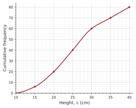
Example 1 A gardener measured the heights, \(h\) cm, of 80 seedlings. The cumulative frequency graph shows the results.
(a) How many seedlings have a height of 15 cm or less?
(b) What percentage of the seedlings are taller than 35 cm?
(c) Find the median height. \(\qquad\) (d) Find the interquartile range.
(e) Find the 90th percentile and explain what it means.
(a) At \(h = 15\) the cumulative frequency is \(6\): 6 seedlings.
(b) At \(h = 35\) the cumulative frequency is \(70\), so \(80 - 70 = 10\) seedlings are taller. \(\dfrac{10}{80} \times 100\% = 12.5\%\).
(c) Go across from \(\frac{80}{2} = 40\): median \(= 25\) cm.
(d) Across from \(20\) gives \(Q_1 = 20\) cm; across from \(60\) gives \(Q_3 = 30\) cm. IQR \(= 30 - 20 = 10\) cm.
(e) \(0.9 \times 80 = 72\). Across from \(72\) gives \(h \approx 36\) cm. So 90% of the seedlings are shorter than about 36 cm (and 10% are taller).
Box-and-whisker diagrams
Five-number summary Not in the formula booklet
The five-number summary of a data set is
\[ \text{minimum}, \quad Q_1, \quad \text{median}, \quad Q_3, \quad \text{maximum}. \]
A box-and-whisker diagram (box plot) draws these five values above a number line. The box goes from \(Q_1\) to \(Q_3\) with a line at the median; the whiskers go out to the minimum and maximum.
- \(Q_1\): the lower quartile
- \(Q_3\): the upper quartile
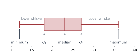
The box shows the middle 50% of the data; each whisker and each half of the box holds about 25% of the data. If a question asks you to show outliers, mark each one with a cross (see Section 15.6).
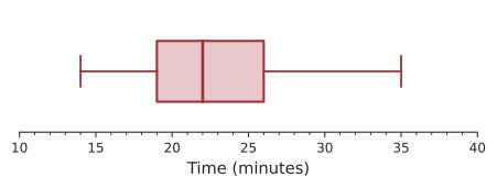
Example 2 The box plot shows the times taken by a group of students to finish a puzzle.
(a) What was the longest time? \(\qquad\) (b) What was the shortest time?
(c) What percentage of students took between 19 and 26 minutes?
(d) The middle 50% of the students’ times were within how many minutes of each other?
(e) In which quarter of the data are the times least spread out?
(f) The fastest 50% of the students’ times were within how many minutes of each other?
The five-number summary is \(14, 19, 22, 26, 35\).
(a) \(35\) minutes. (b) \(14\) minutes.
(c) \(19 = Q_1\) and \(26 = Q_3\), so 50%.
(d) IQR \(= 26 - 19 = 7\) minutes.
(e) The four quarters have widths \(19 - 14 = 5\), \(22 - 19 = 3\), \(26 - 22 = 4\), \(35 - 26 = 9\). The second quarter (from \(Q_1\) to the median) is least spread out.
(f) From the minimum to the median: \(22 - 14 = 8\) minutes.
Parallel box plots
Two box plots drawn on the same scale make it easy to compare two data sets.
Comparing two distributions
- Centre: compare the medians.
- Spread: compare the IQRs (and the ranges).
- Shape: is each one symmetric or skewed? Are there outliers?
Always write your comparison in context (for example “journeys on Route B usually take longer”).
Example 3 The times, in minutes, of 20 bus journeys on each of two routes are:
| Times (minutes) | |
|---|---|
| Route A | 18, 22, 25, 19, 24, 21, 23, 27, 20, 22, 26, 24, 21, 23, 25, 22, 28, 20, 24, 23 |
| Route B | 15, 31, 19, 26, 38, 22, 17, 29, 24, 35, 18, 27, 21, 33, 16, 25, 30, 20, 41, 23 |
(a) Find the five-number summary for each route.
(b) Draw parallel box plots.
(c) Compare the two distributions.
(a) Route A in order: \(18, 19, 20, 20, 21, \;21, 22, 22, 22, 23, \;23, 23, 24, 24, 24, \;25, 25, 26, 27, 28\).
With \(n = 20\): median \(= \frac{10\text{th} + 11\text{th}}{2} = \frac{23 + 23}{2} = 23\); \(Q_1 = \frac{5\text{th} + 6\text{th}}{2} = \frac{21 + 21}{2} = 21\); \(\;Q_3 = \frac{15\text{th} + 16\text{th}}{2} = \frac{24 + 25}{2} = 24.5\).
Route A: \(\;18, \; 21, \; 23, \; 24.5, \; 28\).
Route B in order: \(15, 16, 17, 18, 19, \;20, 21, 22, 23, 24, \;25, 26, 27, 29, 30, \;31, 33, 35, 38, 41\).
Median \(= \frac{24 + 25}{2} = 24.5\); \(\;Q_1 = \frac{19 + 20}{2} = 19.5\); \(\;Q_3 = \frac{30 + 31}{2} = 30.5\).
Route B: \(\;15, \; 19.5, \; 24.5, \; 30.5, \; 41\).
(b)
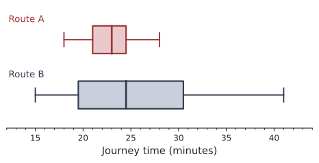
(c) Centre: the median for Route B (\(24.5\) min) is a little higher than for Route A (\(23\) min), so Route B journeys usually take slightly longer.
Spread: Route B is much more spread out: IQR \(11\) min against \(3.5\) min, and range \(26\) min against \(10\) min. Route A is more consistent (more reliable).
Shape: Route A is roughly symmetric. Route B has a longer upper whisker, so it is positively skewed: some Route B journeys take much longer.
Enter the data in a list on a Lists & Spreadsheet page and name it (for example ra). Add a Data & Statistics page, click the horizontal axis label and choose ra. Then Menu → Plot Type → Box Plot. To compare, add a second variable with Menu → Plot Properties → Add X Variable. One-Variable Statistics (see Section 15.3) gives the five-number summary as MinX, \(Q_1\)X, MedianX, \(Q_3\)X, MaxX.
Common errors
| ✗ Wrong | ✓ Right | Why |
|---|---|---|
| Plotting cumulative frequency at the mid-interval value | Plot at the upper class boundary | The total counts all values below the upper boundary. |
| Median from cumulative frequency \(\frac{n + 1}{2}\) for large grouped data | Use \(\frac{n}{2}\) | From a graph we use \(\frac{n}{4}, \frac{n}{2}, \frac{3n}{4}\). |
| Reading the frequency at the median (across instead of down) | Go across from the frequency, then down | The answer is a value on the horizontal axis. |
| “Taller than 35 cm” \(= 70\) in Example 1 | \(80 - 70 = 10\) | The graph shows numbers less than the value. |
| A longer whisker contains more data | Each whisker holds about 25% | A long whisker means the data is more spread, not more numerous. |
Exercises
1 Copy and complete the cumulative frequency column. State the points you would plot.
| Mass, \(m\) (kg) | \(50 \le m < 55\) | \(55 \le m < 60\) | \(60 \le m < 65\) | \(65 \le m < 70\) | \(70 \le m < 75\) |
|---|---|---|---|---|---|
| Frequency | 6 | 15 | 24 | 11 | 4 |
Cumulative frequencies: \(6, 21, 45, 56, 60\).
Points: \((50, 0), (55, 6), (60, 21), (65, 45), (70, 56), (75, 60)\).
2 Using the table in question 1, find
(a) the number of people with mass less than 65 kg,
(b) the number with mass at least 60 kg,
(c) the percentage with mass less than 60 kg.
(a) \(45\).
(b) \(60 - 21 = 39\).
(c) \(\dfrac{21}{60} \times 100\% = 35\%\).
3 In a test taken by 150 students, the 80th percentile is 68 marks. Explain what this means, and find how many students scored less than 68.
80% of the students scored less than 68. \(\;0.8 \times 150 = 120\) students.
4 Find the five-number summary and the IQR of: \(12, 18, 15, 22, 9, 25, 17, 14, 20, 30, 16, 19, 11, 23, 21\).
In order: \(9, 11, 12, 14, 15, 16, 17, \mathbf{18}, 19, 20, 21, 22, 23, 25, 30\) (\(n = 15\)).
Median \(= 18\) (8th). Lower half \(9, 11, 12, \mathbf{14}, 15, 16, 17\): \(Q_1 = 14\). Upper half \(19, 20, 21, \mathbf{22}, 23, 25, 30\): \(Q_3 = 22\).
Five-number summary: \(9, 14, 18, 22, 30\). IQR \(= 8\).
5 The five-number summary of the marks of 200 students is \(40, 52, 58, 66, 85\).
(a) About how many students scored more than 66?
(b) About how many scored between 52 and 85?
(c) Find the range and the IQR.
(a) 25% of 200 \(= 50\).
(b) 75% of 200 \(= 150\).
(c) Range \(= 45\); IQR \(= 14\).
6 The five-number summaries of the marks of two classes are: Class P: \(35, 48, 56, 62, 78\); Class Q: \(42, 50, 60, 64, 70\). Compare the two classes.
Class Q has the higher median (\(60\) against \(56\)), so Q did better on average. The IQRs are equal (\(14\)), so the middle halves are equally spread, but Class P has a much larger range (\(43\) against \(28\)): P has more students with very high or very low marks.
7 The cumulative frequency table shows the lengths of 60 phone calls.
| Length, \(t\) (min), less than | 20 | 30 | 40 | 50 | 60 | 70 |
|---|---|---|---|---|---|---|
| Cumulative frequency | 0 | 6 | 15 | 30 | 48 | 60 |
(a) Write down the median and the lower quartile.
(b) What percentage of calls lasted 60 minutes or more?
(a) \(\frac{60}{2} = 30\) gives median \(= 50\) min. \(\frac{60}{4} = 15\) gives \(Q_1 = 40\) min.
(b) \(60 - 48 = 12\) calls; \(\dfrac{12}{60} \times 100\% = 20\%\).
8 200 runners finished a race. The 90th percentile of their times is 52 minutes. How many runners took longer than 52 minutes?
10% of 200 \(= 20\) runners.
9 The cumulative frequency graph shows the masses, \(m\) g, of 100 apples.
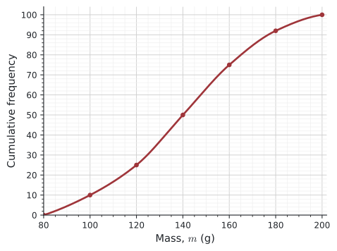
(a) Find the median and the IQR.
(b) How many apples have a mass of 100 g or less?
(c) How many apples are heavier than 180 g?
(d) Estimate the 90th percentile.
(a) Across from \(50\): median \(= 140\) g. Across from \(25\) and \(75\): \(Q_1 = 120\) g, \(Q_3 = 160\) g. IQR \(= 40\) g.
(b) \(10\). (c) \(100 - 92 = 8\).
(d) Across from \(90\): about \(177\) g.
10 Find the five-number summary of this data and describe its box plot.
| \(x\) | 1 | 2 | 3 | 4 | 5 | 6 |
|---|---|---|---|---|---|---|
| Frequency | 3 | 5 | 8 | 6 | 4 | 2 |
\(n = 28\). Running totals: \(3, 8, 16, 22, 26, 28\).
Median: 14th and 15th values, both \(3\), so median \(= 3\). Lower half = first 14 values; its median is between the 7th and 8th values, both \(2\): \(Q_1 = 2\). Upper half = 15th to 28th values; its median is between the 21st and 22nd values, both \(4\): \(Q_3 = 4\).
Five-number summary: \(1, 2, 3, 4, 6\). The box goes from 2 to 4 with the median at 3; the whiskers go to 1 and 6, so the upper whisker is longer.